The core logo combines our icon mark with the wordmark to form the primary brand signature
Use this lockup as the default across all communications, marketing materials, and partner placements. It is available in both horizontal and stacked orientations — choose based on the space available.


The wordmark presents the full company name in our proprietary typeface without the icon mark.
Use it when the logo has already been established in context, space is limited, or a cleaner typographic treatment is preferred. It is also our most suitable fabrication logo for use cases such as embroidery or etching.

Our logomark is a standalone icon
The logomark is a simplified standalone icon used in space-constrained environments such as app icons, favicons, and social avatars. It should only be used where the Xtremepush brand is already clearly established.

Always maintain clear space around the logo
Always maintain sufficient clear space around the logo to preserve its visibility and impact. This space ensures the mark is never crowded or visually compromised by surrounding elements.


Use the logo on approved backgrounds only
The logo should only be used in its approved colour variations. It must always maintain strong contrast against its background to ensure clarity and legibility. When placed on non-brand background colours, the appropriate approved logo version should be used to preserve contrast. Unapproved colours, gradients, or effects must not be applied.


Embroidery — branded merchandise
When reproducing the logo through embroidery, simplicity and legibility are key. Stitching techniques can introduce visual limitations, so the logo should always be applied in its approved single-colour variations.
Avoid fine details, gradients, or complex backgrounds. The logo should remain crisp, balanced, and clearly recognisable across all embroidered applications such as apparel and promotional items.

Etching — laser, embossed & engraving applications
For etched or engraved applications, the logo should be reproduced in a single colour or as a monochrome mark. This ensures clarity across materials such as metal, glass, or wood.
Always prioritise contrast and avoid overly intricate detailing that may be lost in production. The integrity of the mark must be preserved regardless of medium.


1.8 / Quick Download
Fabrication logos
Fabrication Logos are specially designed for precision applications like embroidery, etching, laser etching, and embossing. They use clean lines, simplified shapes, and minimal detail to ensure crisp, accurate results across a wide range of production methods.


1.9 / Usage to Avoid
Incorrect use of the logo can weaken brand recognition and create inconsistency
Avoid altering the logo in any way, including stretching, recolouring, adding effects, or combining it with other graphic elements. Do not place the logo on backgrounds that reduce legibility or contrast.
When in doubt, default to the approved logo variations and treatments outlined in this library.

Avoid stretching or distorting the logo.

Do not change the colour of any part of the logo.

Do not reposition any part of the logo lock up.

Do not resize any part of the logo lock up.

Do not attempt to use the logo mark with a different word mark.

Do not apply any unofficial brand colours to any part of the logo lock up.
Co-branding and partner logo lockups.
When displaying partner logos alongside Xtremepush, ensure both marks are presented with equal consideration and clarity. Maintain balanced spacing and scale, and clearly separate logos to avoid visual confusion.


How to read our logo file names
Each logo filename has three parts:
Type: (logo, mark, or wordmark).
Layout (stacked, horizontal, short).
Background: (_dark = for use on dark backgrounds, _light = for use on light backgrounds). The suffix describes where to use it, not the colour of the logo itself.
XP_logo_horizontal_light

XP_wordmark_short_dark
XP_wordmark_light
1.13 /
Logos for light backgrounds
Use these logo assets when placing the brand on light or neutral backgrounds. These versions are optimised to maintain clarity, contrast, and visual balance in brighter environments.
Select the appropriate file format depending on your use case. SVG files are recommended for web and digital interfaces due to their scalability and performance, while EPS files should be used for print applications, particularly in CMYK workflows. PNG files are suitable for general digital use where a raster format is required.


1.14 /
Logos for dark backgrounds
These logo variations are designed specifically for use on dark or high-contrast backgrounds. The light version of the logo ensures strong visibility and brand presence without compromising legibility.
Always ensure sufficient contrast between the logo and its background.


1.15 /
Single colour logo
The single-colour logo is used in situations where full-colour reproduction is not possible or appropriate. This includes print limitations, merchandise, or specialist production methods.
Use only approved single-colour variations and ensure the logo remains clear and recognisable at all sizes.
Single-colour versions that include the logomark are not suitable for etching or embroidery applications, as the logomark relies on gradient detail that cannot be accurately reproduced in these formats.


1.13 / XpertOS
XpertOS Logos
The XpertOS logo represents a key component of the Xtremepush product offering. While it exists as a distinct and named technology within the platform, it remains part of the wider brand ecosystem.
We use a single XpertOS logo across different approved colour variations. It follows the same core branding principles as the primary Xtremepush logo, including rules around spacing, scale, and application.
Always treat the XpertOS logo with the same level of care and consistency as all other Xtremepush brand assets.


1.16 / Partners
XP Partners logo
These assets belong to the XP Partners sub-brand. They are provided to approved clients and partners for use on their own websites and channels to declare their partnership with us.
Use these logos as supplied. Do not alter, combine, or co-brand them with other marks.
Logos for light backgrounds
Use these logo assets when placing the brand on light or neutral backgrounds. These versions are optimised to maintain clarity, contrast, and visual balance in brighter environments.


1.17 /
Logos for dark backgrounds
These logo variations are designed specifically for use on dark or high-contrast backgrounds. The light version of the logo ensures strong visibility and brand presence without compromising legibility.


1.18 /
Badges
A compact logo format for use in tight spaces, these badges can be applied by partners or internally to indicate an official partnership.
 Google Slide
Main Slide Deck Template
Our main branded slide deck that should be the basis of every starting deck.
Go to template gallery.jpg) Google Slide
Google Slide
 Google Slide
4.2 / Brand Resources
Google doc templates
Our document templates provide a consistent framework for written communication, from internal documents to client deliverables. All templates are available within the Google Docs template gallery and can be accessed directly when creating a new document. Selecting the appropriate template ensures correct formatting, typography, and layout from the outset.
 Google Doc
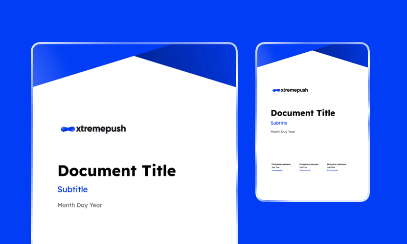
Standard Document Template
A general-purpose document template for internal and external communications, preformatted with Xtremepush brand styles.
Go to template gallery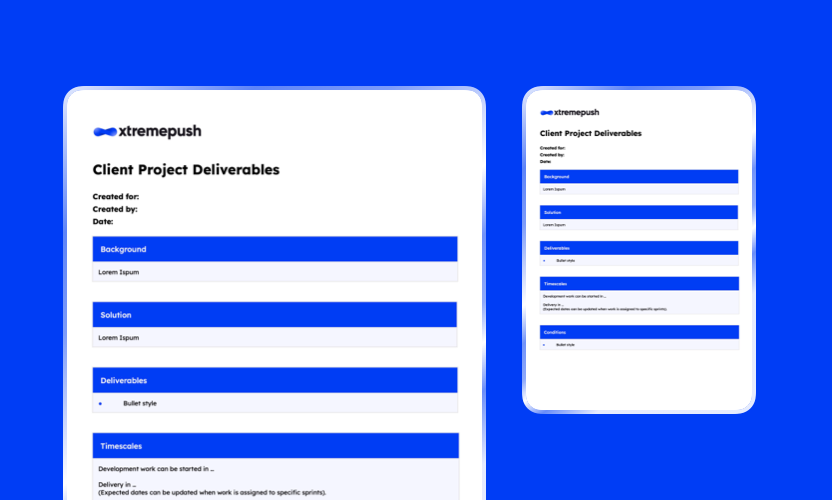 Google Doc
XP Client Project Deliverables Template
A structured template for presenting client deliverables clearly and consistently.
Go to template gallery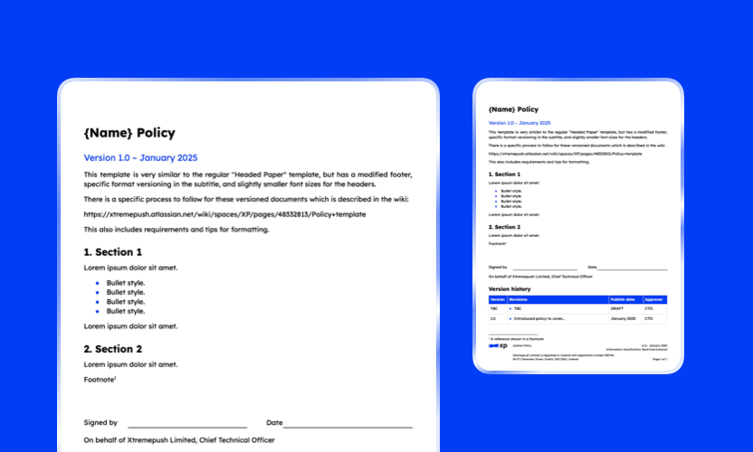 Google Doc
Policy Template
A formal document template designed for internal policies and governance materials.
Go to template gallery Google Doc
XP On Premise Pre-sale Qualification Template
This document is to qualify the need and scale of an On Premise request and outline the required resource provision. For use in the pre-sale process.
Go to template gallery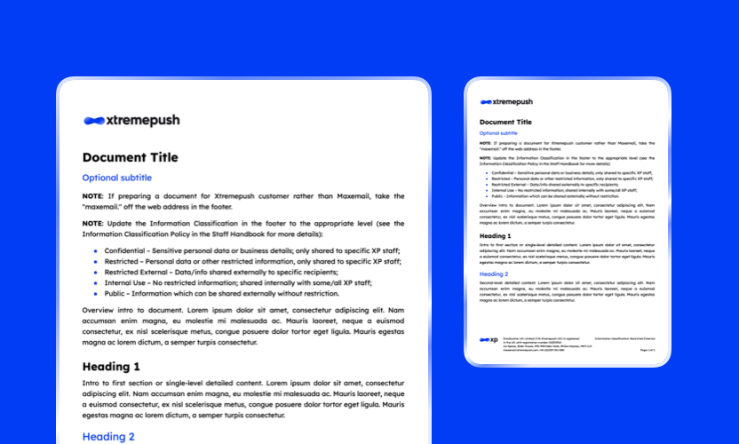 Google Doc
Emailcenter Headed Paper Generic Template
Official branded document templates for formal correspondence and external communication.
Go to template gallery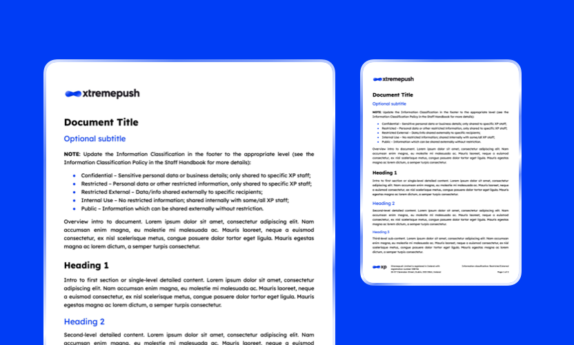 Google Doc
Headed Paper Generic Template
Official branded document templates for formal correspondence and external communication.
Go to template gallery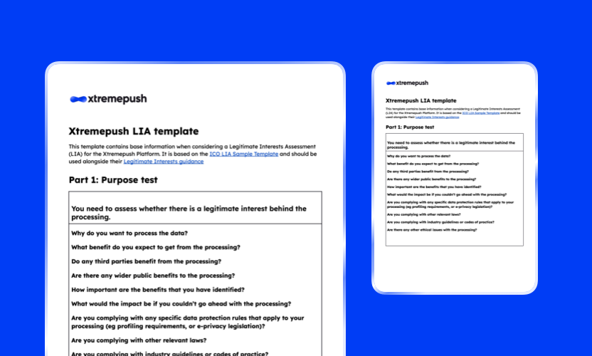 Google Doc
Xtremepush LIA Template
A standardised template for completing Legitimate Interest Assessments in line with compliance requirements.
Go to template gallery5.1 / Games
Games templates
Each Figma file is structured to present a complete view of the game experience, including all available screens and states within a single file. This enables a clear understanding of user flows, interactions, and variations.
The files are built using reusable components and interconnected design systems. This approach allows key elements to be updated efficiently, with changes cascading throughout the template where relevant.
As a result, targeted edits to a defined set of assets can significantly transform the overall appearance of a game, supporting rapid customisation and scalable production workflows.
 Figma
Figma
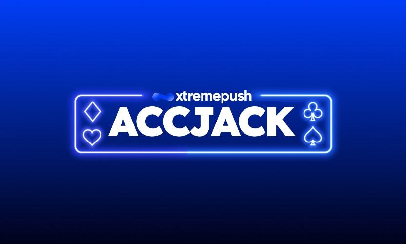
AccJack
A blackjack-inspired game adapted for promotional use, blending familiarity with simplified mechanics.
Open Figma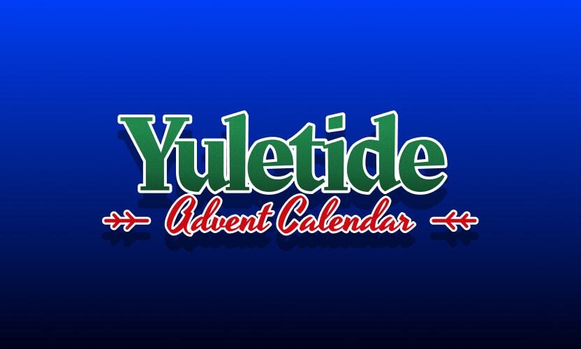 Figma
Figma
Advent Calendar
A time-based experience that unlocks rewards over a defined period, encouraging repeat engagement.
Open Figma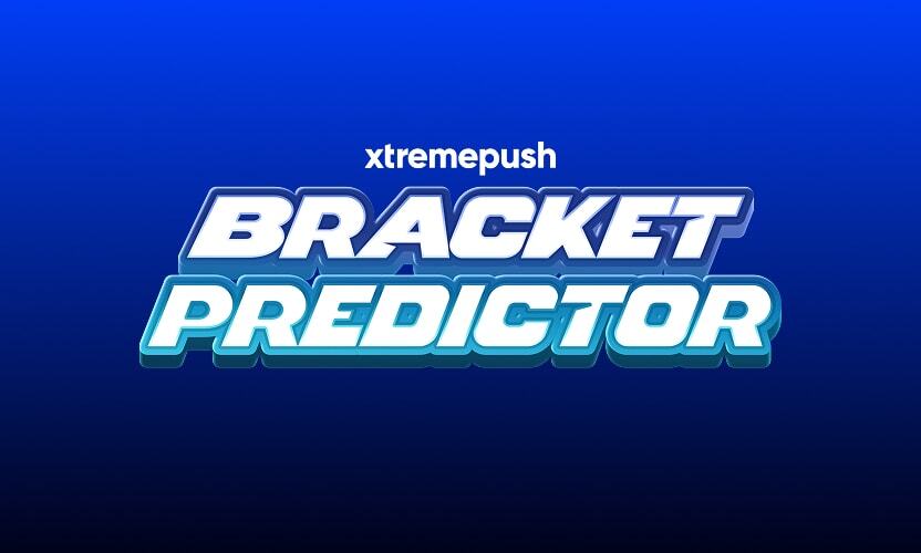 Figma
Figma
Bracket Predictor
A tournament-style prediction game where users forecast outcomes across multiple rounds.
Open Figma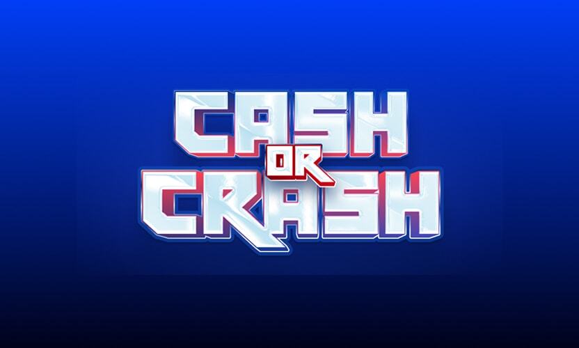 Figma
Figma
Crash
A high-intensity, risk-and-reward game where users must act before the multiplier resets, designed to create urgency and excitement.
Open Figma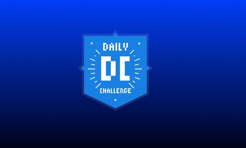 Figma
Figma
Daily Challenge
A time-based or skill-based challenge designed to encourage daily participation and consistent engagement.
Open Figma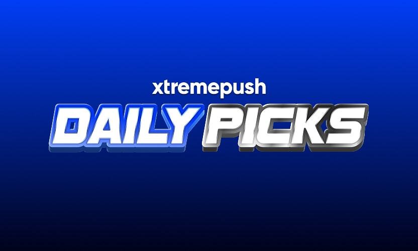 Figma
Figma
Daily Picks
A recurring prediction-based game where users make daily selections, driving habitual engagement and return visits.
Open Figma Figma
Figma
Daily Picks (Streaks)
A variation of Daily Picks that rewards consecutive participation through streak-based progression.
Open Figma Figma
Figma
Derby Dash (OTB)
A race-themed game format where participants track progress and outcomes in a competitive, fast-moving environment.
Open Figma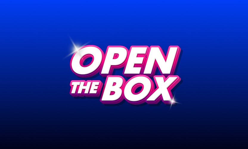 Figma
Figma
Open The Box
A mystery-driven experience where users select from multiple options to reveal hidden rewards or outcomes.
Open Figma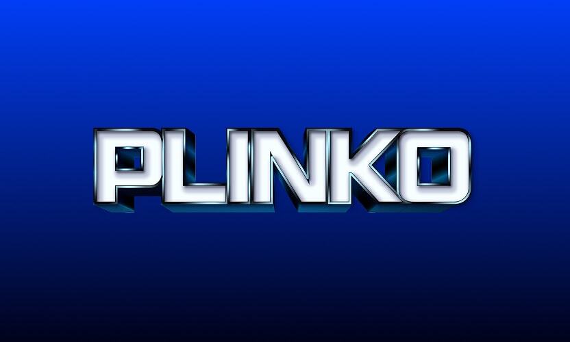 Figma
Figma
Plinko
A chance-based game inspired by the classic Plinko format, combining randomness and anticipation to create an engaging user experience.
Open Figma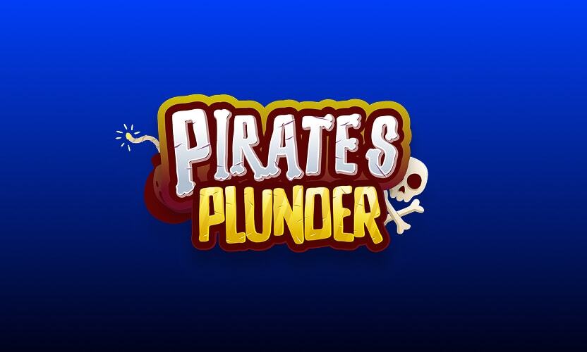 Figma
Figma
 Figma
Figma
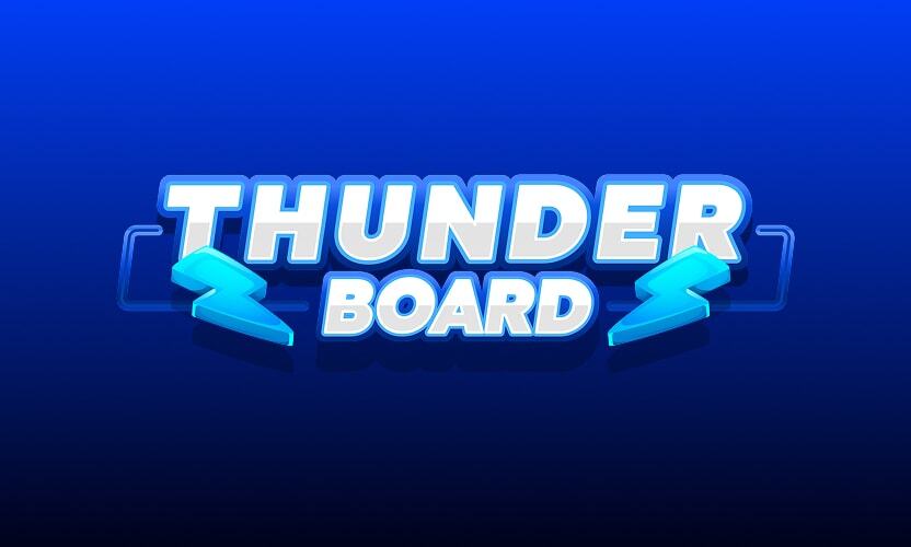
Progressive Tunderboard
A dynamic leaderboard-style game that builds engagement over time, encouraging repeat interaction through progressive rewards and competitive positioning.
Open Figma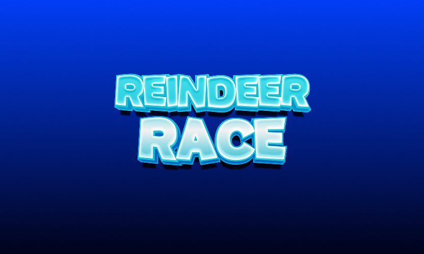 Figma
Figma
 Figma
Figma
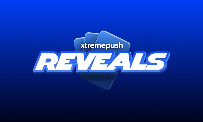
Reveals
An interactive reveal mechanic where users uncover hidden outcomes, prizes, or messages through progressive interaction.
Open Figma Figma
Figma
Standard Predictor
A flexible prediction format that can be adapted to various events or scenarios.
Open Figma6.1 / Available Builders
Available builders
Below is a list of the Game Visual Builders currently available for use. Each builder provides a quick and flexible way to customise game visuals with specific branding, themes, sports, or data sets to suit your project requirements. All builders are password protected and use the same password as the Brand Library for access.
 Builder